Easy input validation with HTML, CSS, and (a little bit of) React
Also available as a Medium article.
It’s no surprise that HTML form validation can quickly become overly complicated to manage. During a recent code challenge that I was working through, I discovered a simple way to do input field validation using minimal JSX/React and documented input attributes and CSS.
This approach takes advantage of native HTML controls and attributes, CSS psuedo-classes and psuedo-elements, and minimal React code. This results in a solution that is easy to manage as more inputs are added and provides an accessible experience to keyboards and screen readers.
Basic Setup
This guide assumes that you already know how to build a simple <input /> as a stateful component with React’s useState hook and the input’s value and onChange attributes. For further information you can read React’s input API reference. Let’s take a quick look at our basic setup.
We are going to use minimal CSS styling throughout so that we can focus just on the structure and functionality. At the end of this guide there is a fully functional and styled example for reference.
HTML
Not much to see here, and we won’t be using it anymore beyond this #root element.
<div id="root"></div>
CSS
This will give us some simple alignment of the #root container to get our examples into the center of the viewport.
#root {
  width: 100vw;
  height: 100vh;
  display: flex;
  justify-content: center;
  align-items: center;
}
JSX
This will create a simple label and input for entering a string of text to be used as someone’s username.
import React, { useState } from "https://esm.sh/react";
import ReactDOM from "https://esm.sh/react-dom";


function RootContainer() {
  const [username, setUsername] = useState('');

  function handleUsernameChange(e) {
    setUsername(e.target.value);
  }

  return (
    <div>
      <label for="signup-username">Username</label>
      <input id="signup-username" type="text" value={username} onChange={handleUsernameChange} required />
    </div>
  );
}


const root = ReactDOM.createRoot(document.getElementById('root'));
root.render(
  <React.StrictMode>
    <RootContainer />
  </React.StrictMode>
);
Result
See the Pen Easy input validation 1 by Josh Harrison (@Josh-Harrison) on CodePen.
Add a validation pattern
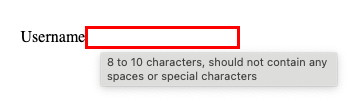
We are going to use the input’s pattern attribute to specify a regular expression that the value should match. For our example, we will require that the username contains 8 to 10 alphanumeric characters and no special characters. We’ll also add a simple style to the input’s :valid and :invalid pseudo-classes to illustrate the two states.
NOTE: These pseudo-classes use red and green to convey invalid and valid. To meet accessibility guidelines it is never recommended to convey meaning by color alone. We will improve these styles as we continue.
JSX
// ...

// Add the pattern attribute and value to the input element
return (
    <div>
      <label for="signup-username">Username</label>
      <input
        id="signup-username"
        type="text"
        value={username}
        onChange={handleUsernameChange}
        required
        pattern="\w{8,10}"
      />
    </div>
  );

// ...
CSS
/* Add two pseudo-classes to your CSS */
#signup-username:invalid {
  border: 3px solid red;
}

#signup-username:valid {
  border: 3px solid green;
}
Result
See the Pen Easy input validation 2 by Josh Harrison (@Josh-Harrison) on CodePen.
Add helper text
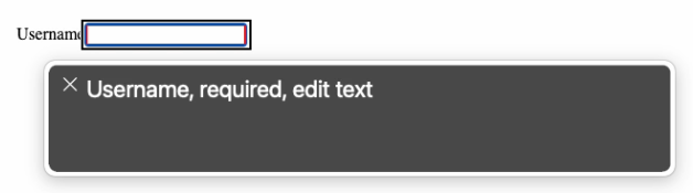
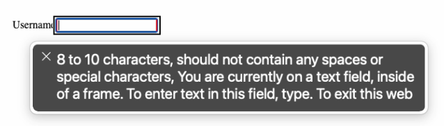
Now we will add helper text to the input to describe the expected format. We need to make sure that the helper text is accessible to support a screen reader. The pattern spec suggests using a title attribute. The title attribute is represented as a tooltip and is announced as secondary or supplemental information by a screen reader.
JSX
// ...

// Add the title attribute and value to the input element
return (
    <div>
      <label for="signup-username">Username</label>
      <input
        id="signup-username"
        type="text"
        value={username}
        onChange={handleUsernameChange}
        required
        pattern="\w{8,10}"
        title="8 to 10 characters, should not contain any spaces or special characters"
      />
    </div>
  );

// ...
Result
- Mouse Hover
- Screen Reader
See the Pen Easy input validation 3 by Josh Harrison (@Josh-Harrison) on CodePen.
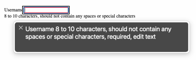
An alternative to using a title tooltip is to add visible text that describes the input using aria-describedby. The aria-describedby attribute expects an HTML id of the text that describes it. For our example, we will add helper text with a unique id as a sibling to the input and point the input to the helper text using aria-describedby. Using this method puts visible text on the page that is still announced by a screen reader as secondary or supplemental text when the screen reader focuses on the input.
JSX
// ...

// Add the aria-describedby attribute and the helper text sibling
return (
    <div>
      <label for="signup-username">Username</label>
      <input
        id="signup-username"
        type="text"
        value={username}
        onChange={handleUsernameChange}
        required
        pattern="\w{8,10}"
        aria-describedby="signup-username-helper-text"
      />
      <div id="signup-username-helper-text">
        8 to 10 characters, should not contain any spaces or special characters
      </div>
    </div>
  );

// ...
Result
- Screen Reader
See the Pen Easy input validation 4 by Josh Harrison (@Josh-Harrison) on CodePen.
Validation status icon
Now that we have validation and helper text, let’s add a visual cue indicating whether the field is valid or not. For this example we will use a heavy exclamation point (❗) and a heavy check mark (✔) to indicate invalid and valid, respectively. We can easily add a div as a direct sibling to the input in our JSX and then use a CSS psuedo-class to show either the checkmark or the exclamation point psuedo-element.
JSX
// ...

// Add the div.validation-status directly after the input
return (
    <div>
      <label for="signup-username">Username</label>
      <input
        id="signup-username"
        type="text"
        value={username}
        onChange={handleUsernameChange}
        required
        pattern="\w{8,10}"
        aria-describedby="signup-username-helper-text"
      />
      <div className="validation-status"></div>
      <div id="signup-username-helper-text">
        8 to 10 characters, should not contain any spaces or special characters
      </div>
    </div>
  );

// ...
CSS
/* Modify the two psuedo-classes to use the direct sibling's psuedo-element */
#signup-username:invalid + .validation-status:after {
  content: "\2757";
}

#signup-username:valid + .validation-status:after {
  content: "\2714";
}
Result
See the Pen Easy input validation 5 by Josh Harrison (@Josh-Harrison) on CodePen.
Check validation on an action
With all of the foundational elements, attributes, and styles in place, we can add a button that will check for any invalid fields when it is clicked. This way we can simulate blocking the data submit if the field or any number of fields are invalid.
In order to check the validity of the input field, we have to attach a ref to it to keep track of it. The ref will allow us to use the checkValidity() helper to summarize the validity state as either true or false. There are a good number of specific validity checks you can do by using the input’s ValidityState API, but for our example we will use the overall boolean check.
JSX
// Add the useRef hook to your imports
import React, { useRef, useState } from "https://esm.sh/react";

// ...

const [username, setUsername] = useState('');
// Add a ref to the username input
const usernameRef = useRef(null);

// ...

// Add a click handler for the submit button
function handleSubmitClick() {
  // Check the validity status of the input field
  const isValid = usernameRef.current.checkValidity();
  if (isValid) {
    alert("Success!");
  } else {
    alert("Please try again.");
  }
}

// ...

// Add a Submit button with an onClick
<div className="validation-status"></div>
<div id="signup-username-helper-text">
  8 to 10 characters, should not contain any spaces or special characters
</div>
<button onClick={handleSubmitClick}>Submit</button>

// ...
Result
See the Pen Easy input validation 6 by Josh Harrison (@Josh-Harrison) on CodePen.
Wrap-up
That’s it, you have an easy way to do input validation.
If you wanted to add more fields to your form you could still easily validate them by
- Assigning individual
ref’s to eachinput - Modify the
handleSubmitClickhandler to loop through each of theinputrefs andcheckValidityto set an overallisValidvalue
There are other input types that you can use in your form and configuring validation on them is the same as described in this guide. For instance, you could have <input type="email" /> and use pattern=".+@\w+.com" to ensure a valid email@example.com format is expected. Likewise, you could have <input type="password"> that expects 8 characters with 1 or more special characters and use pattern="[\w+!@$&%]{8}".
Here is an example of a sign up form that uses all three.
See the Pen Sign Up form with easy input validation by Josh Harrison (@Josh-Harrison) on CodePen.